Sassy Scoopable Smoothy
A frozen smoothie you eat with a spoon, and a brand loud enough to explain why.
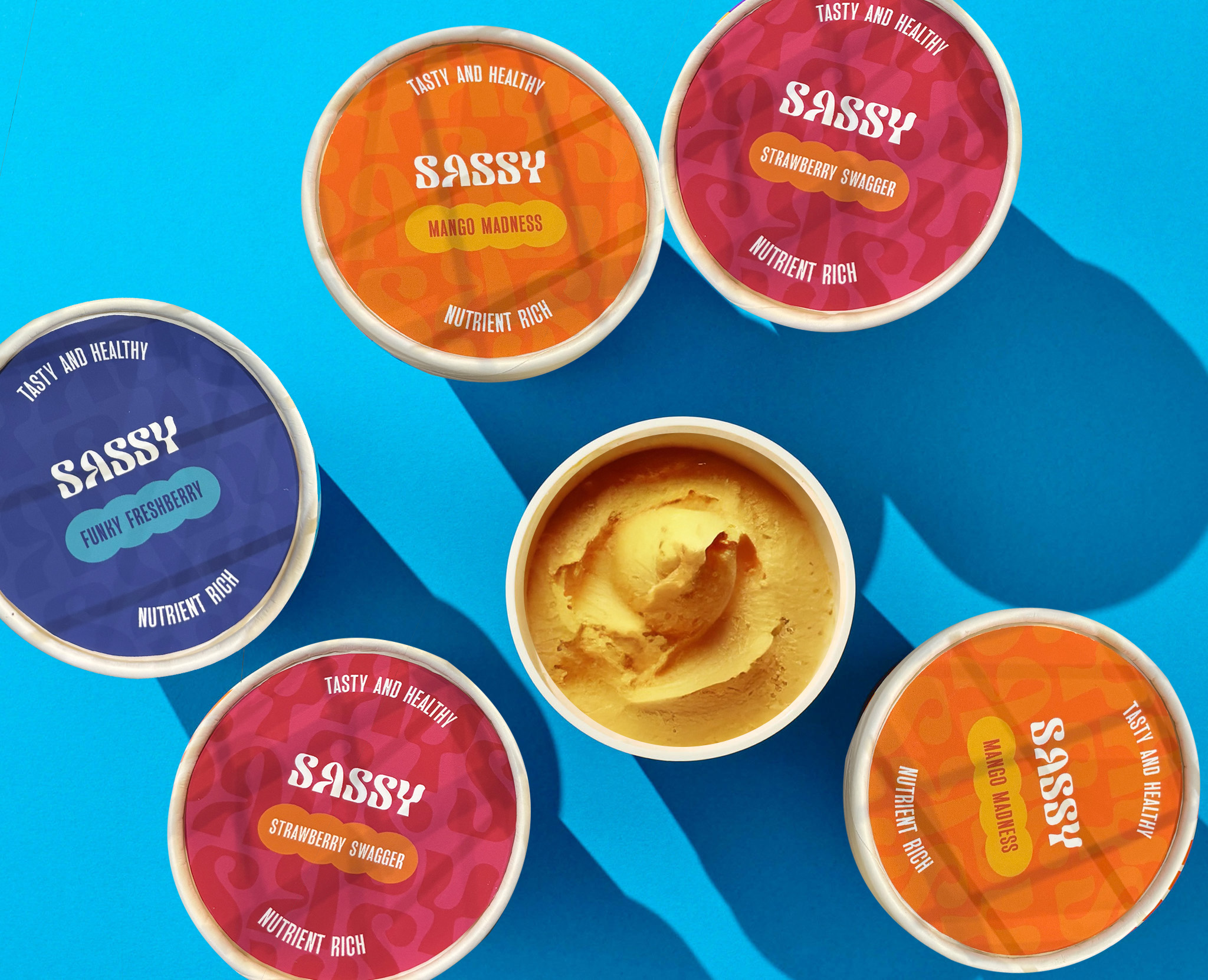
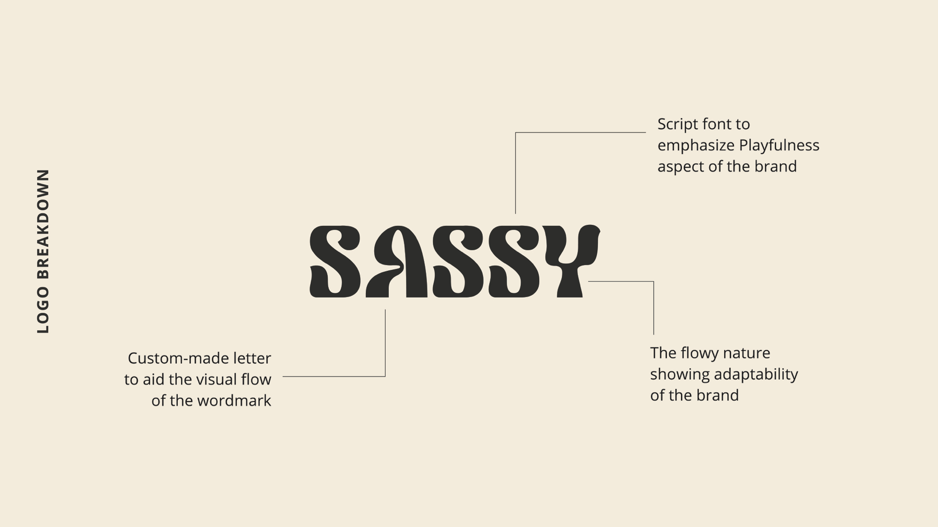
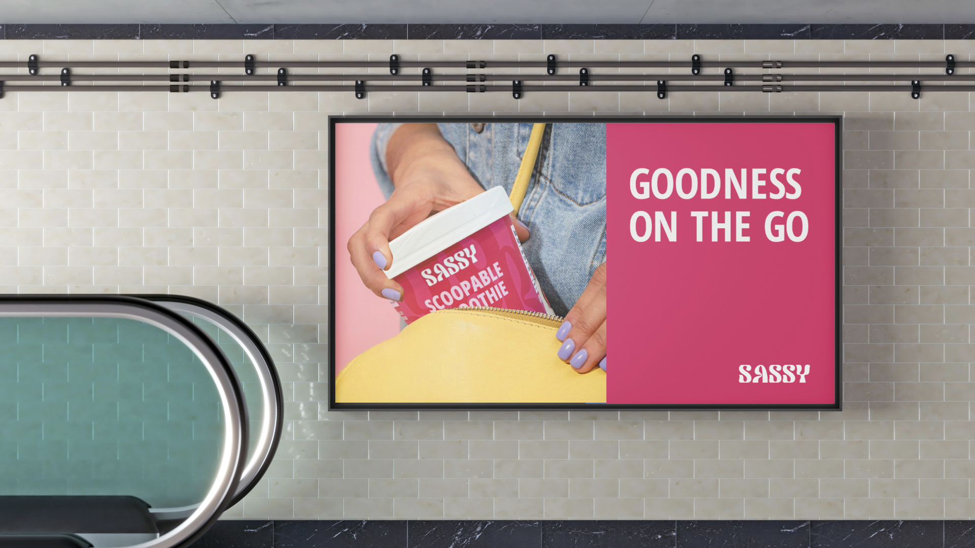
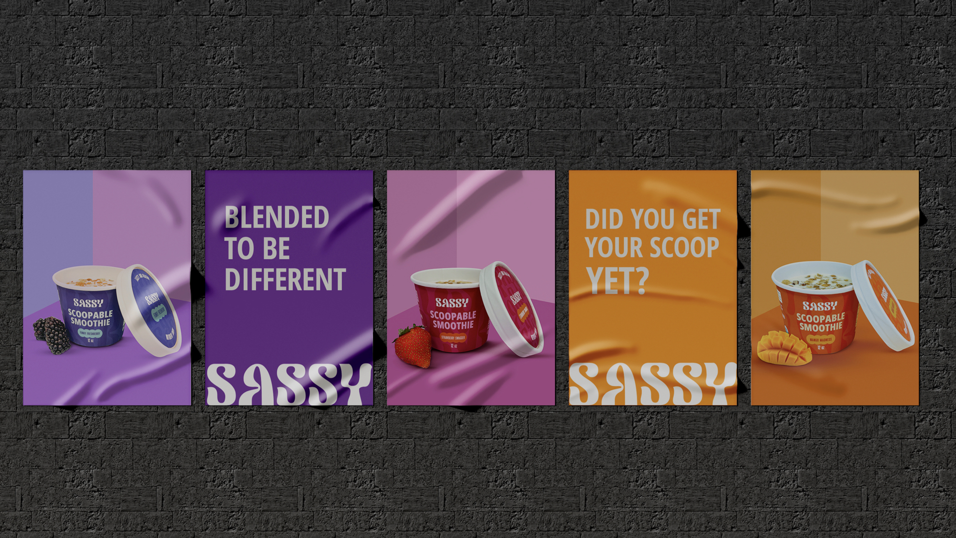
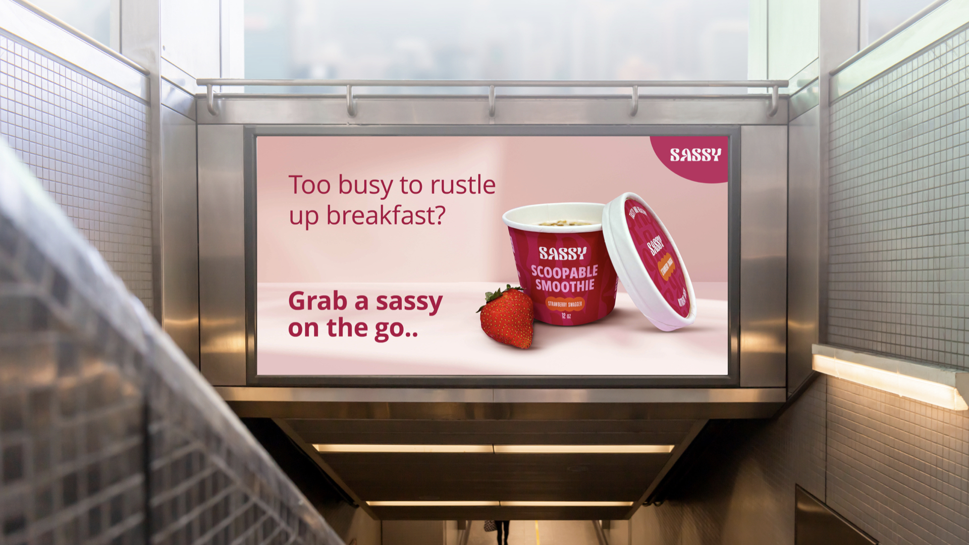
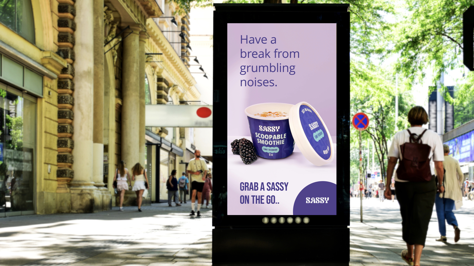
A smoothie that behaves like ice cream needed a shelf presence that behaved like neither. The identity runs on saturated flavour coding, a soft display face with some swagger in the letterforms, and lid artwork designed to be read from directly above, which is how the product is actually photographed and stacked.
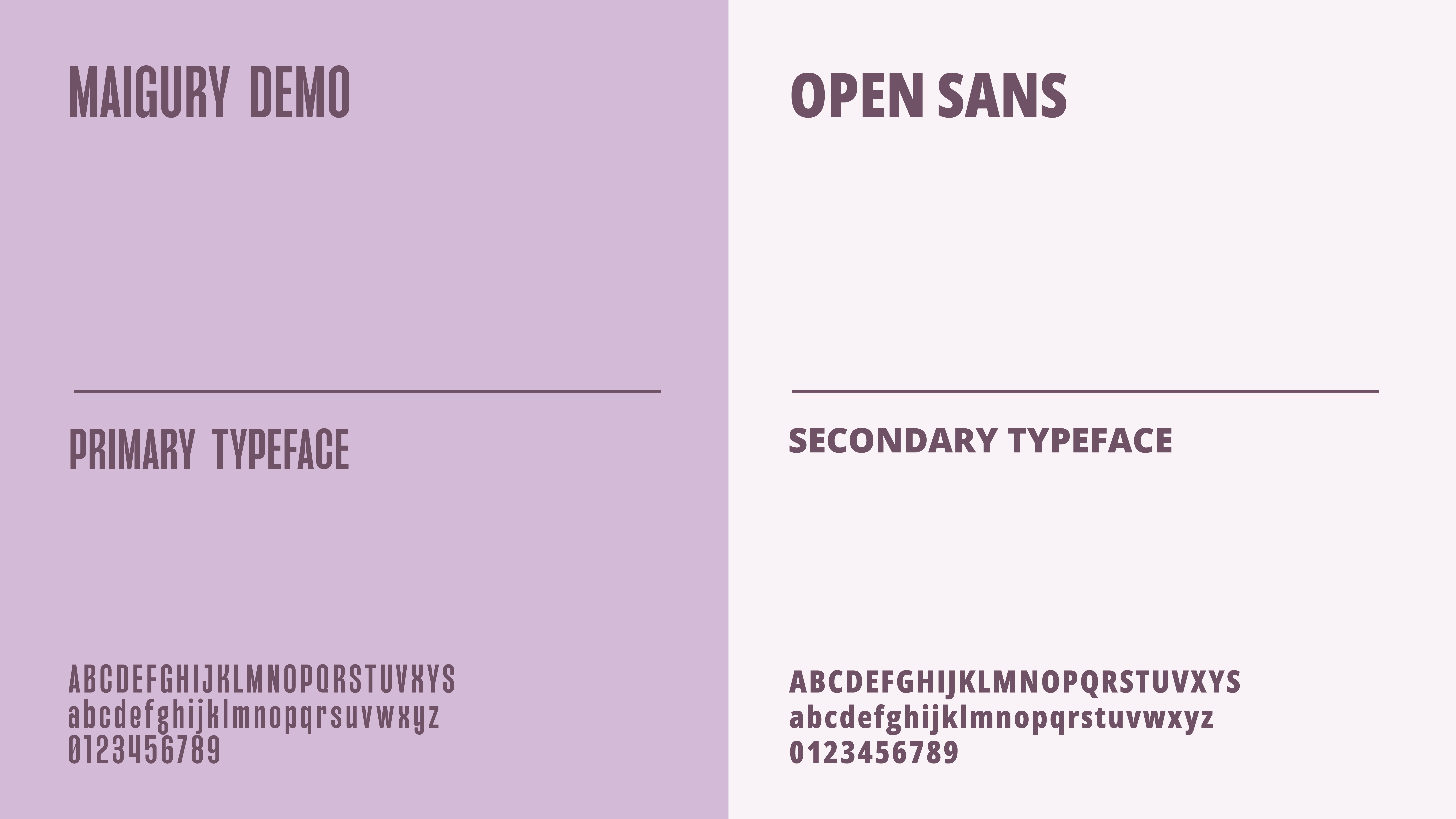
The system covers three flavours, a typographic pairing built for small pack copy, and a photography direction that keeps everything in hard daylight. [Placeholder copy — replace with the real write-up once the case study format is set.]